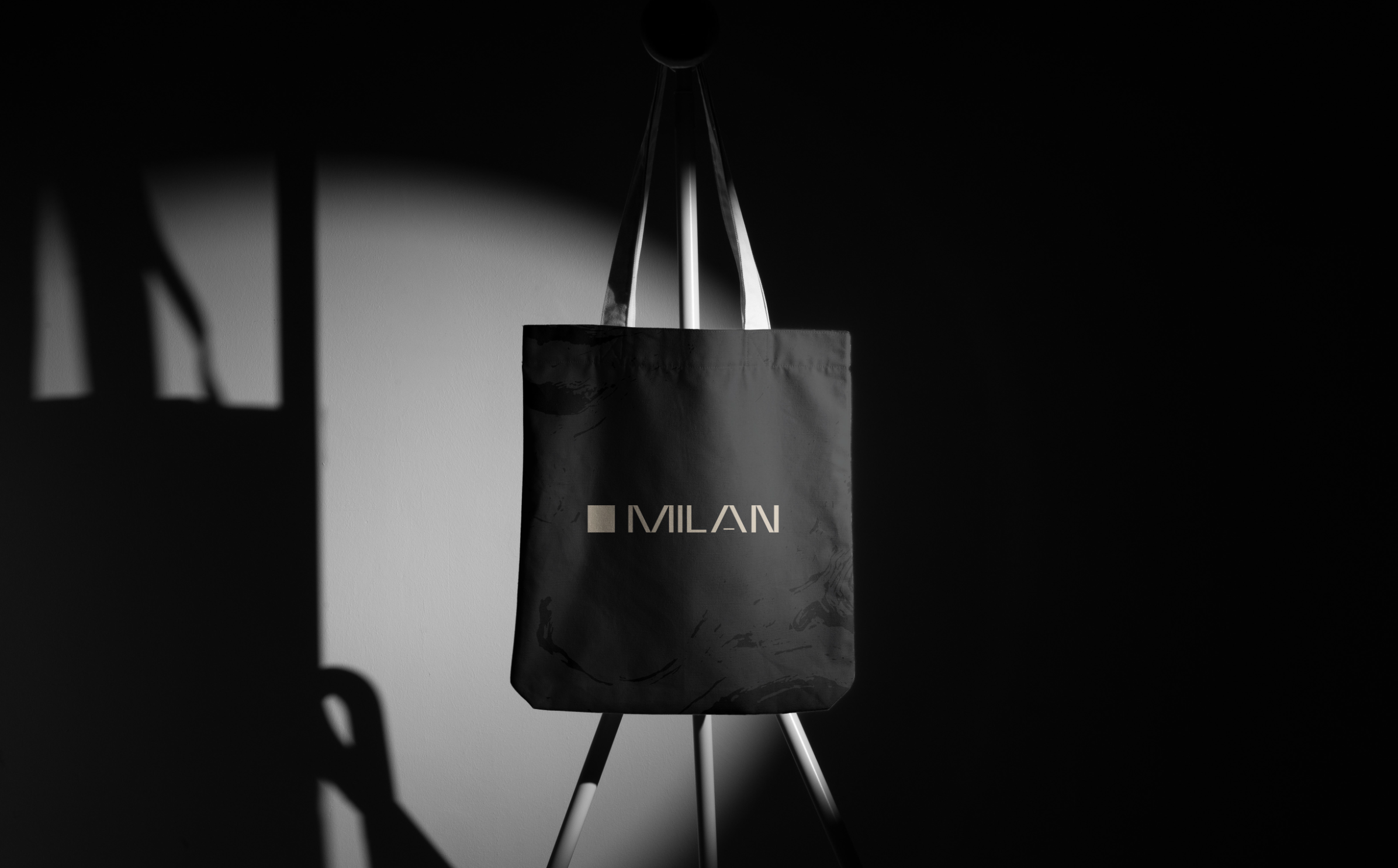
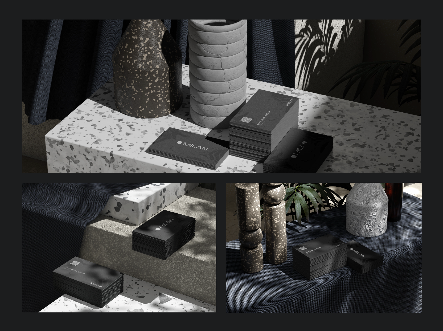
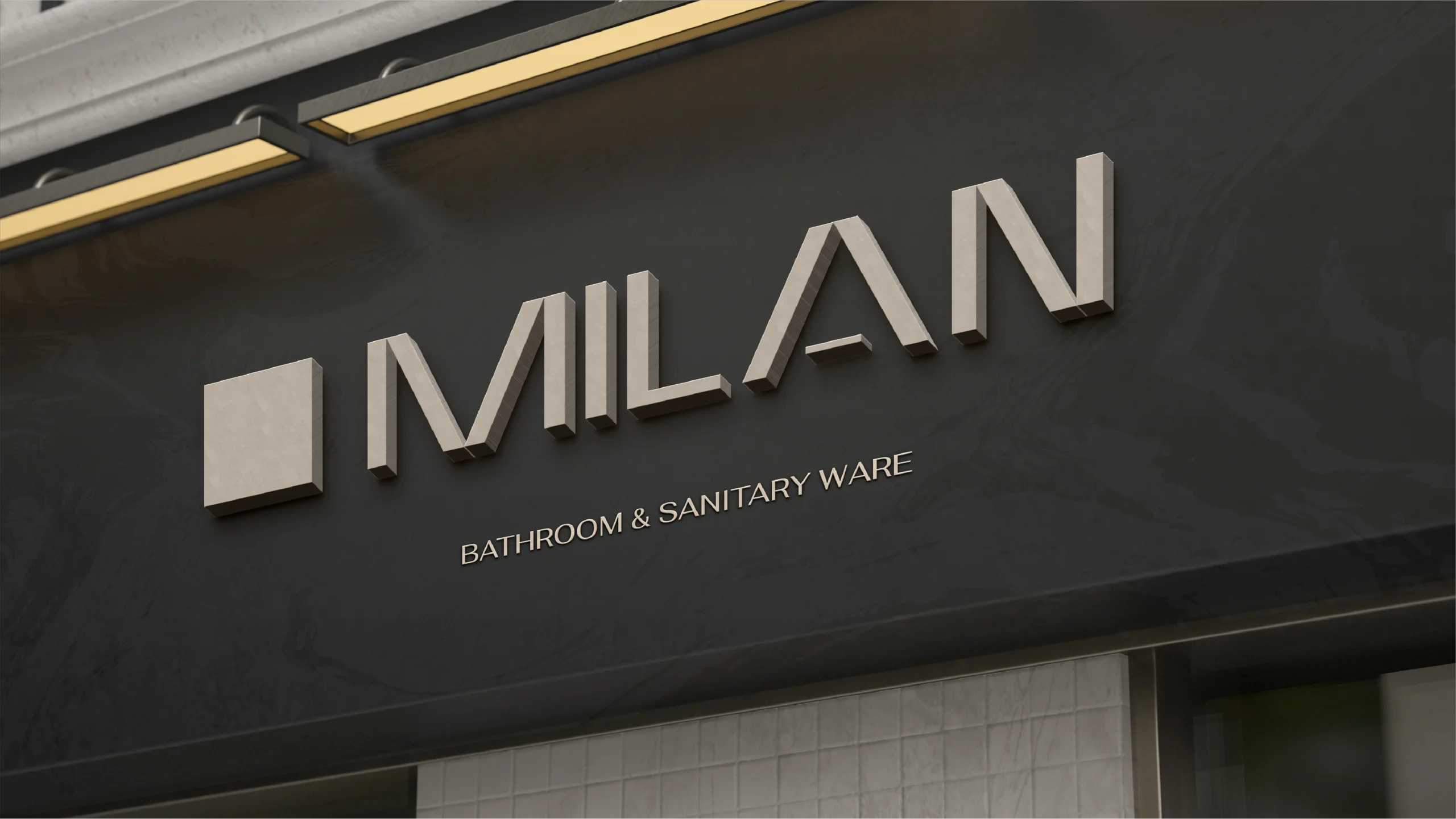
Brand Identity System
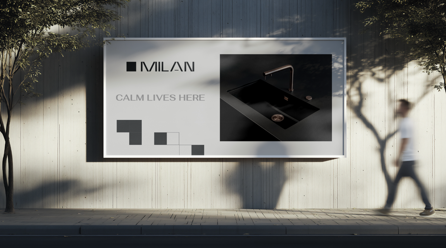
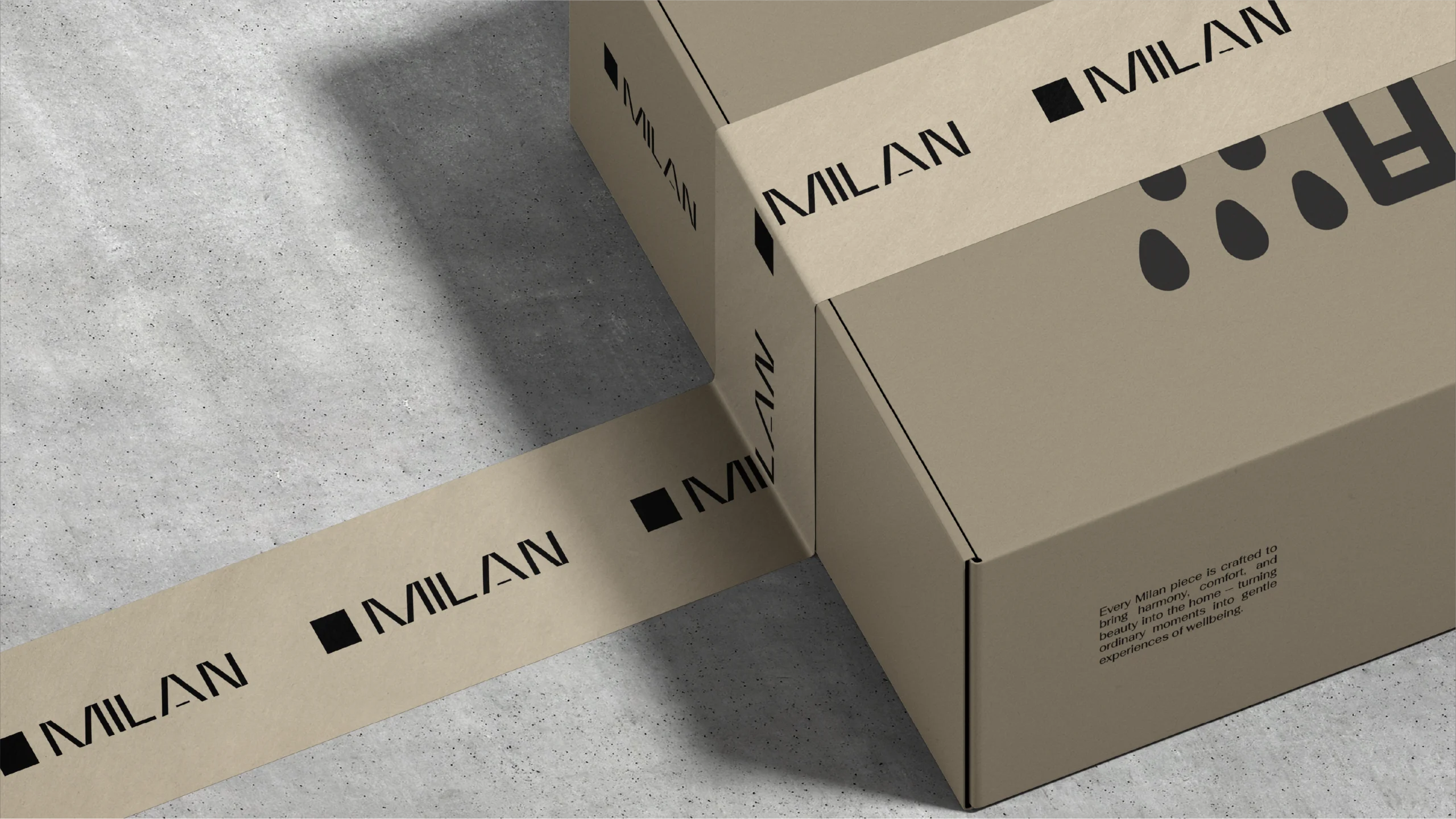
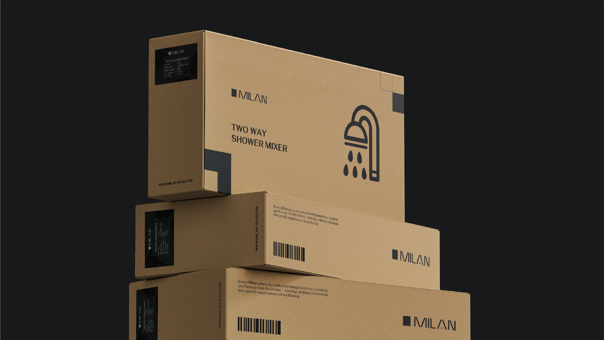
MILAN

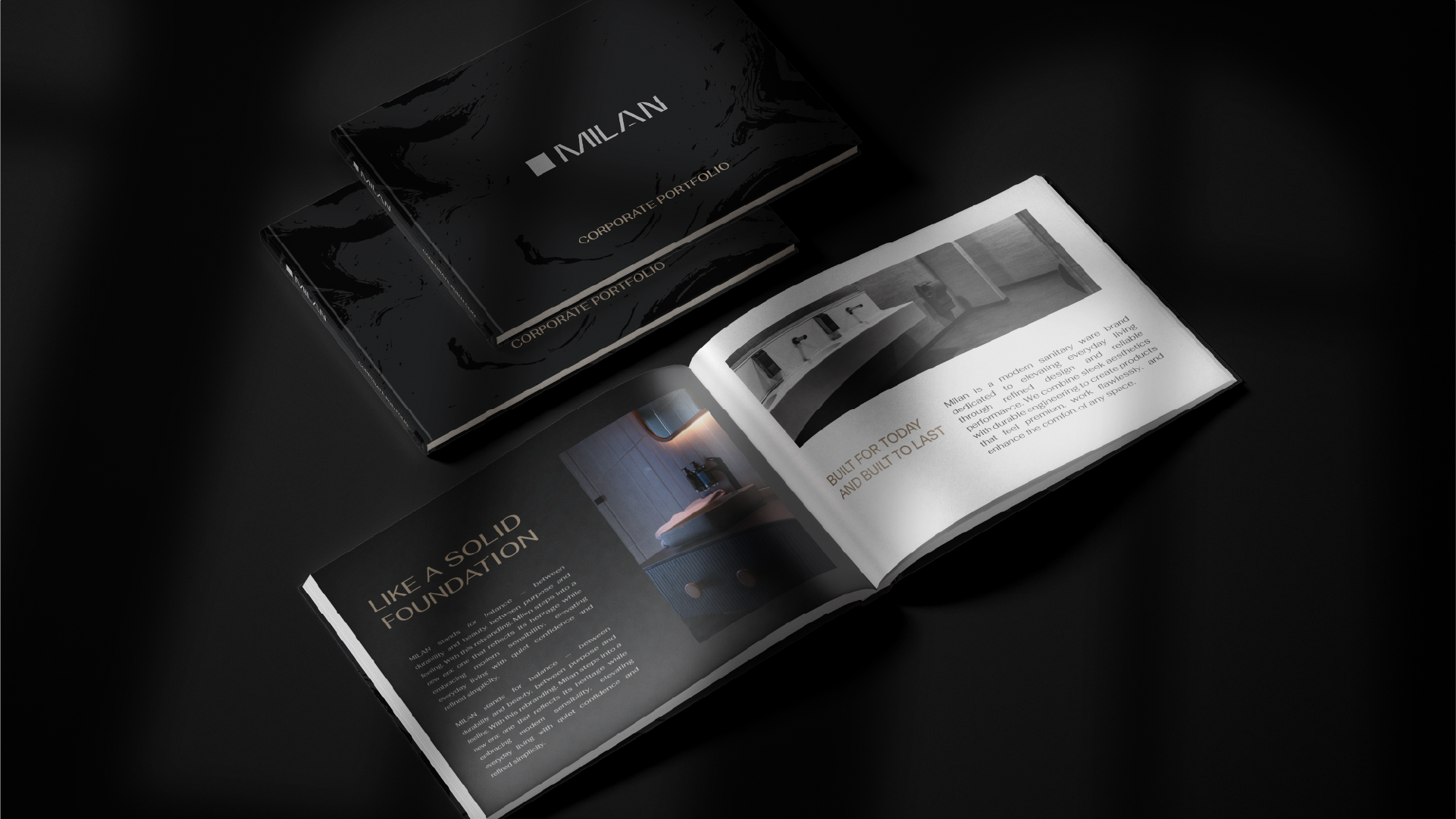
MILAN stands for balance; between durability and beauty, between purpose and feeling. With this rebranding, Milan steps into a new era: one that reflects its heritage while embracing modern sensibility, elevating everyday living with quiet confidence and refined simplicity.

Share

BEFORE
Bold and structured, but feels rigid and product-focused.
More industrial than emotional
AFTER
Reflects modern lifestyle, calm, and refined simplicity.
Minimal, balanced, and elegant
symbolizing balance and unity
How function, aesthetics, and wellness come together in Milan’s design language
Iconography Rule
The design of all primary icons is structurally based on the brand's key visual element, the single square symbol. As such, the underlying construction rule dictates that all primary icons must be built from the combination of equal square shapes on a foundational grid, guaranteeing geometric consistency and uniform scaling across the entire set.