
Brand Identity System · Fitness
Life Sport Center embodies a new era of fitness. Elevated, modern, and purposeful. The rebrand introduces a minimalist yet elegant identity that reflects balance, strength, and sophistication; every detail designed to uplift the brand to a higher standard.
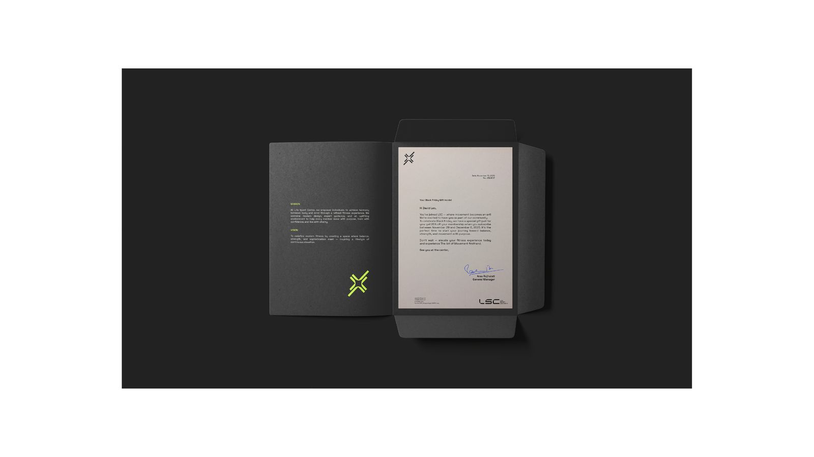
Rebrand: logo, identity system, interior and wayfinding graphics, membership cards and apparel.
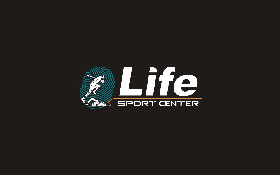
Life Sport Center had an illustrated logo of a runner and a swimmer that read as generic sport. The new identity had to signal a premium club, balance, strength and sophistication, and still feel alive on apparel, walls and screens.
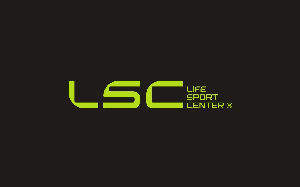




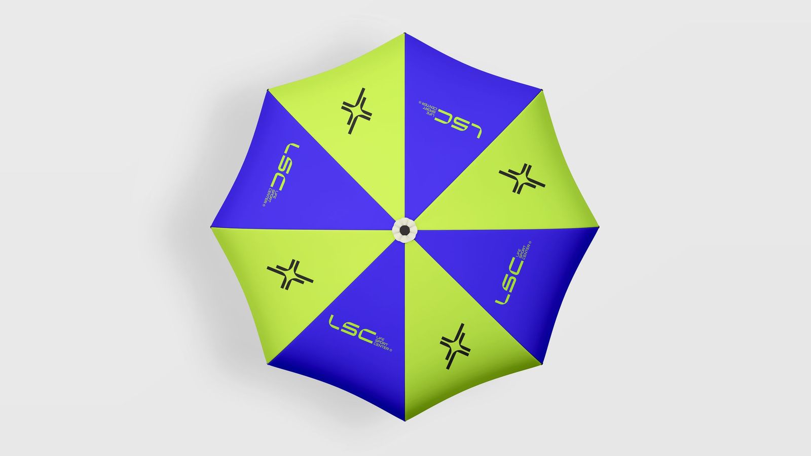
The Art of Movement: one monogram that reads four ways. The letter L, a check of progress, a forward arrow, and motion itself.
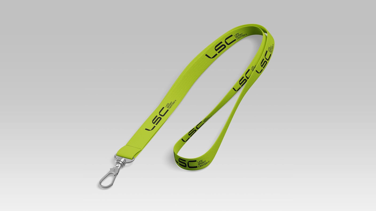


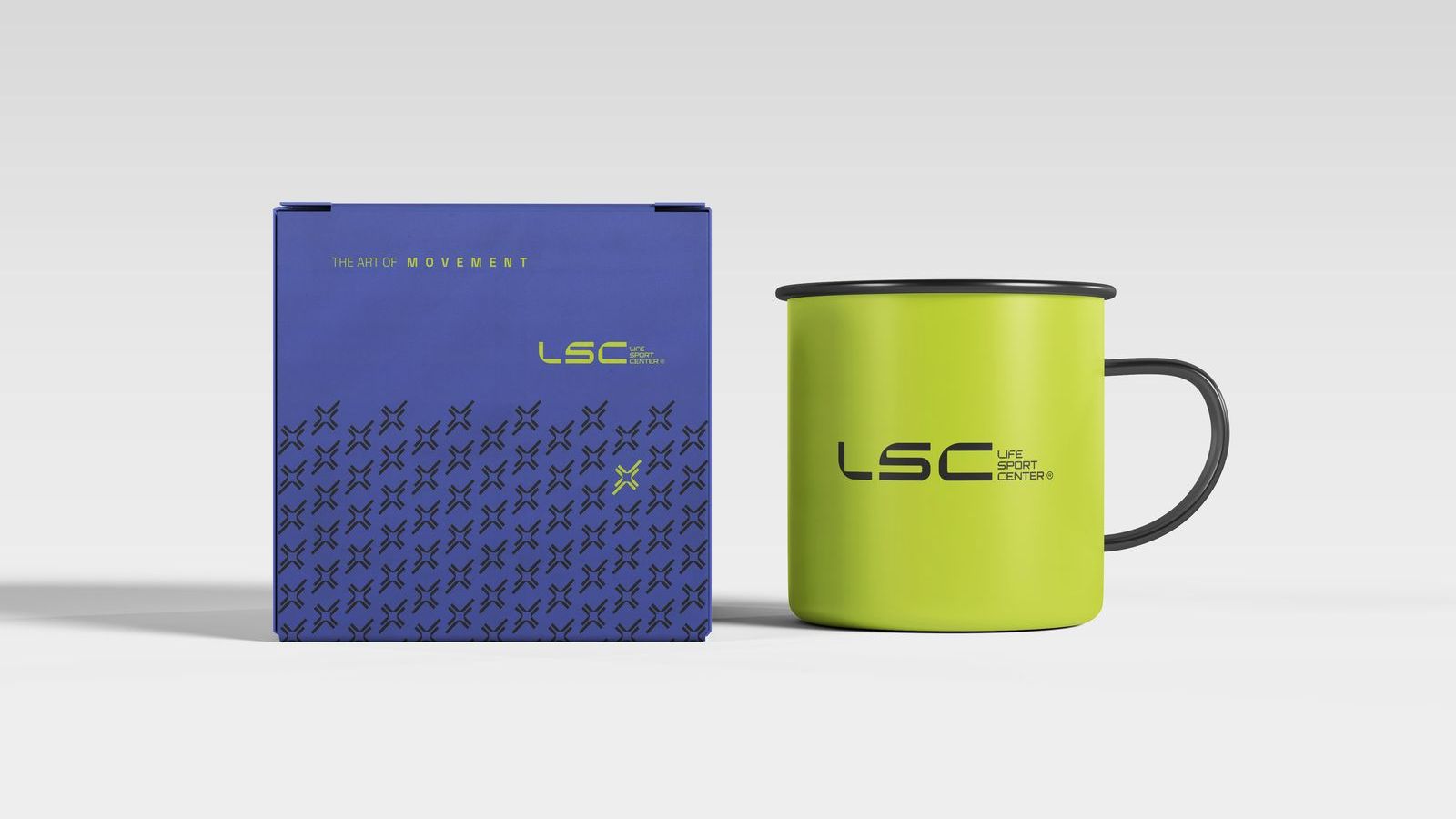
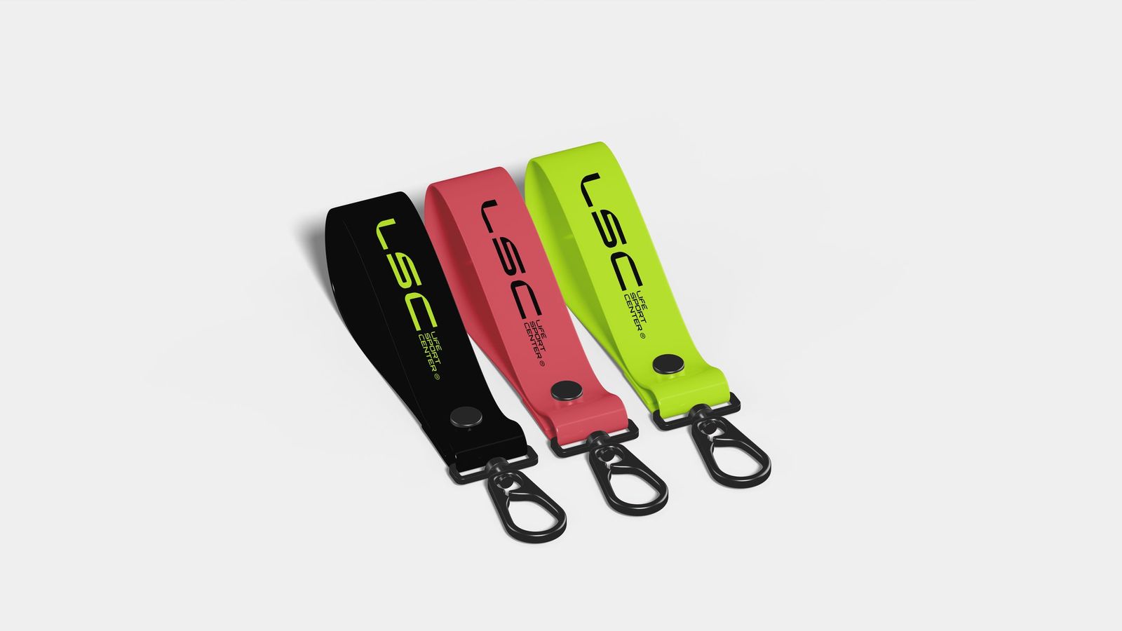

Movement became the brand: one mark that reads as an L, a check, a forward arrow and motion.
Warm, refined and motivating. It talks about self-respect, not punishment.
“Since you love yourself, move.”
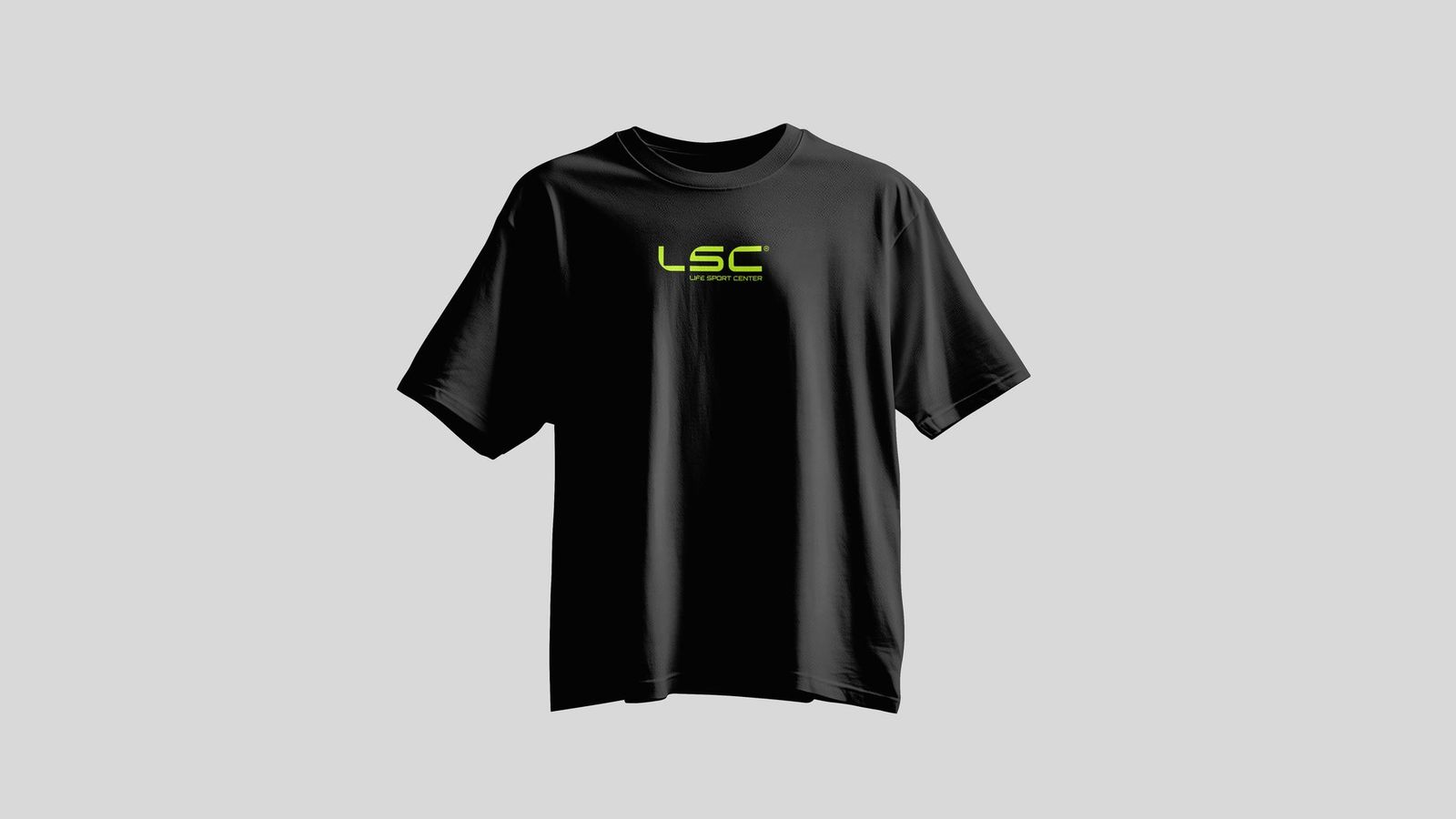
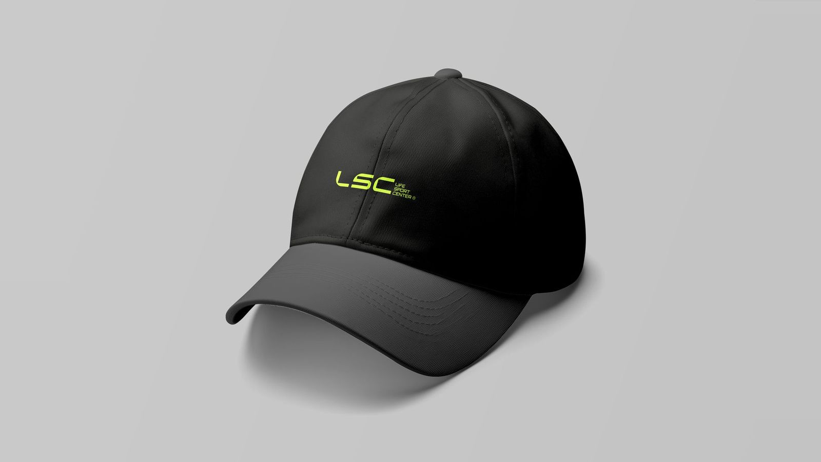
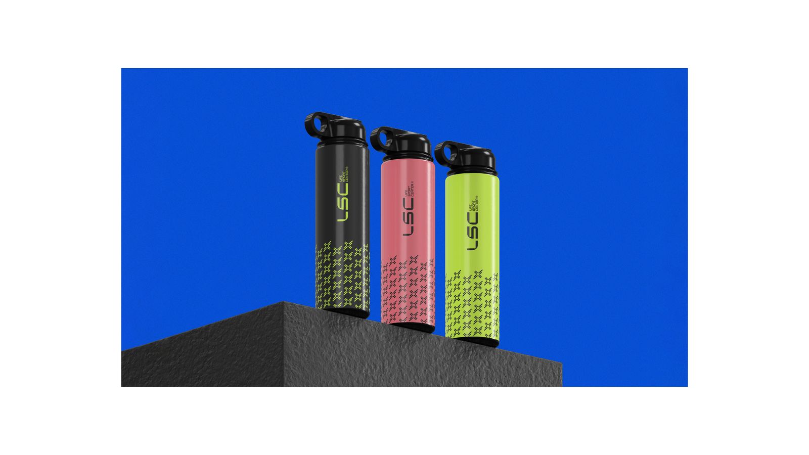
Apparel, walls, membership cards, bottles and social media, all moving in the same rhythm.

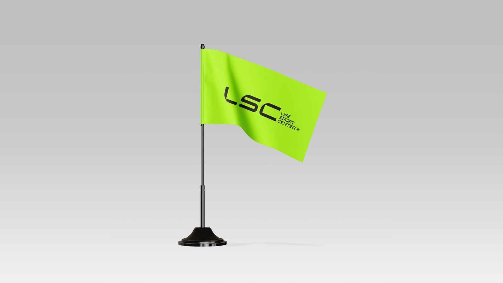
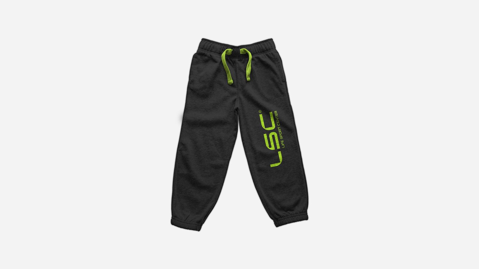
Since you love yourself: move. The rebrand took Life Sport Center from a literal running figure to a pure kinetic mark, one stroke that never stands still, set in volt green on carbon black.

Next chapter