Brand Identity · NGO
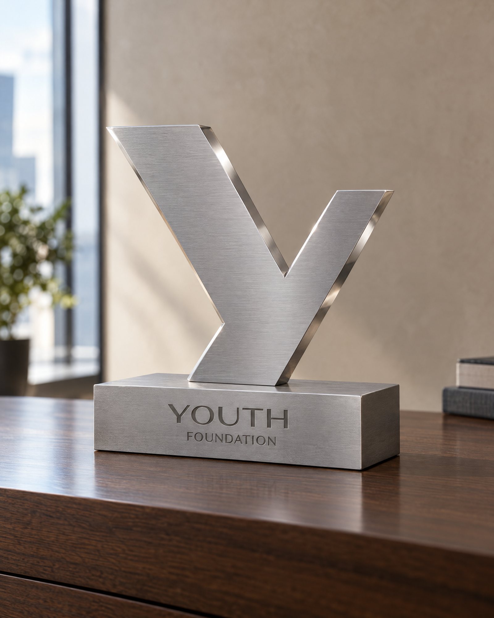
Youth Foundation stands for young people finding their direction. The identity pairs an upward mark with a confident bilingual system, built to live everywhere from official signage to streetwear.
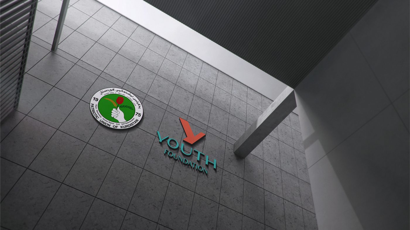
Identity and guideline: logo system, stationery, signage and merchandise.
Youth Foundation is the PUK’s institution for youth and student affairs, inside and outside the Kurdistan Region. It needed an identity young people would actually wear, while still carrying the weight of an official institution.

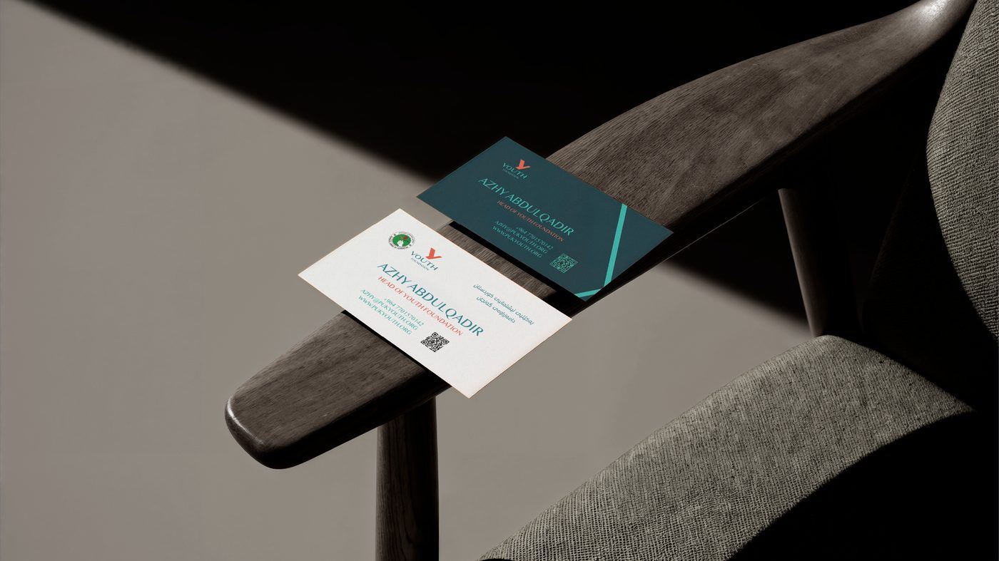
A system built on convergence and direction, where two paths unify into a single forward movement.
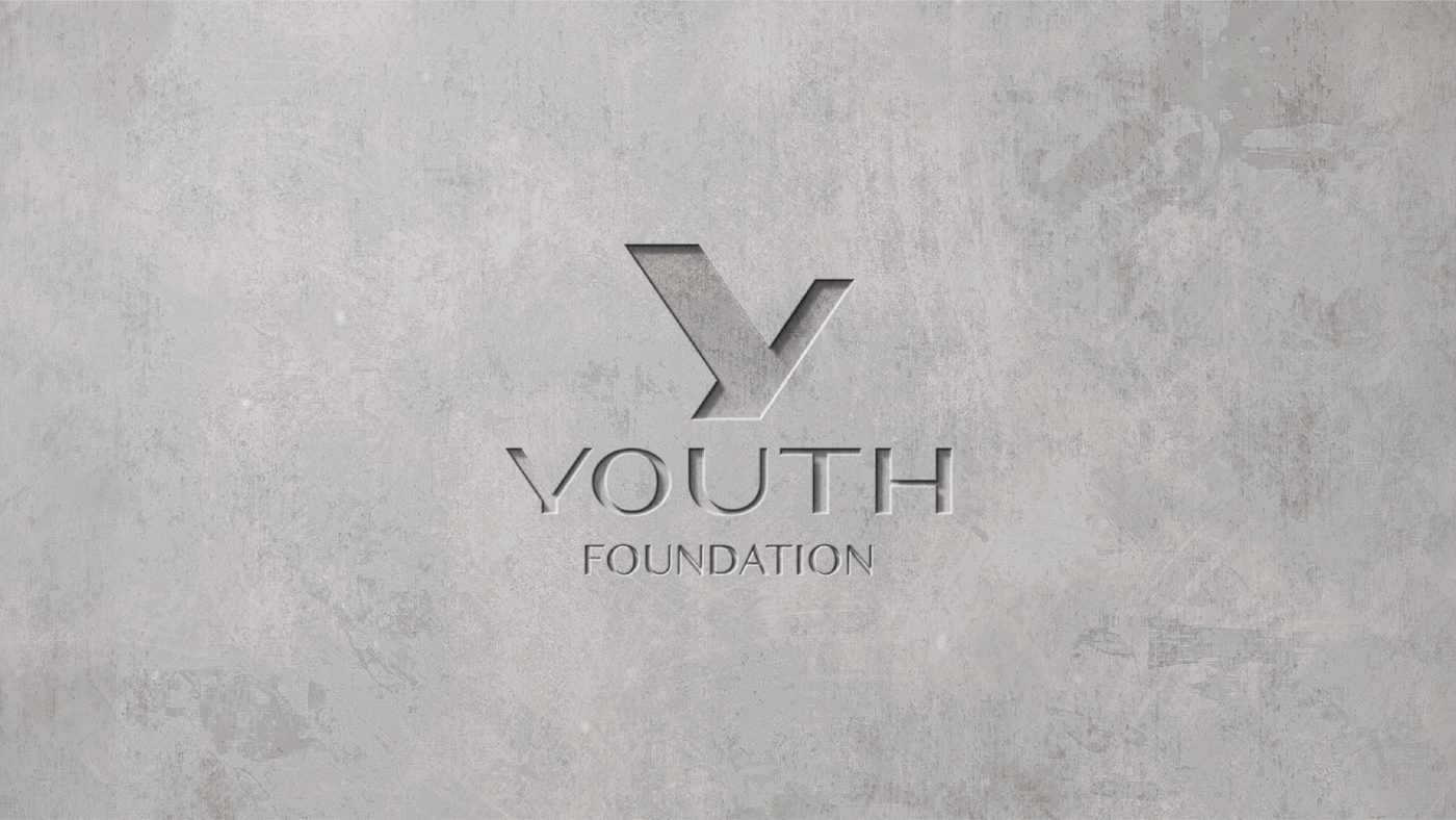
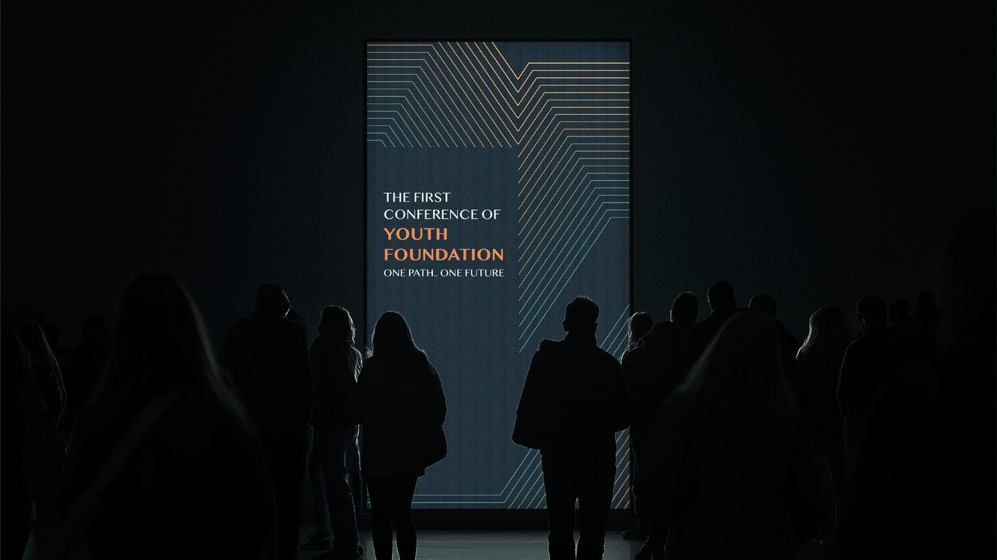
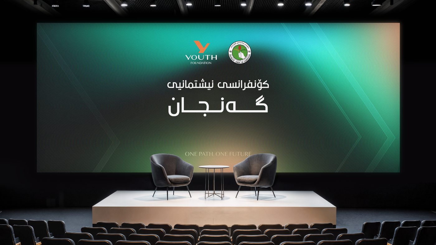
Two paths meeting in one upward Y: young people moving forward together.
Hopeful and inclusive. One line carries the whole identity.
“Different Paths, Moving Together.”
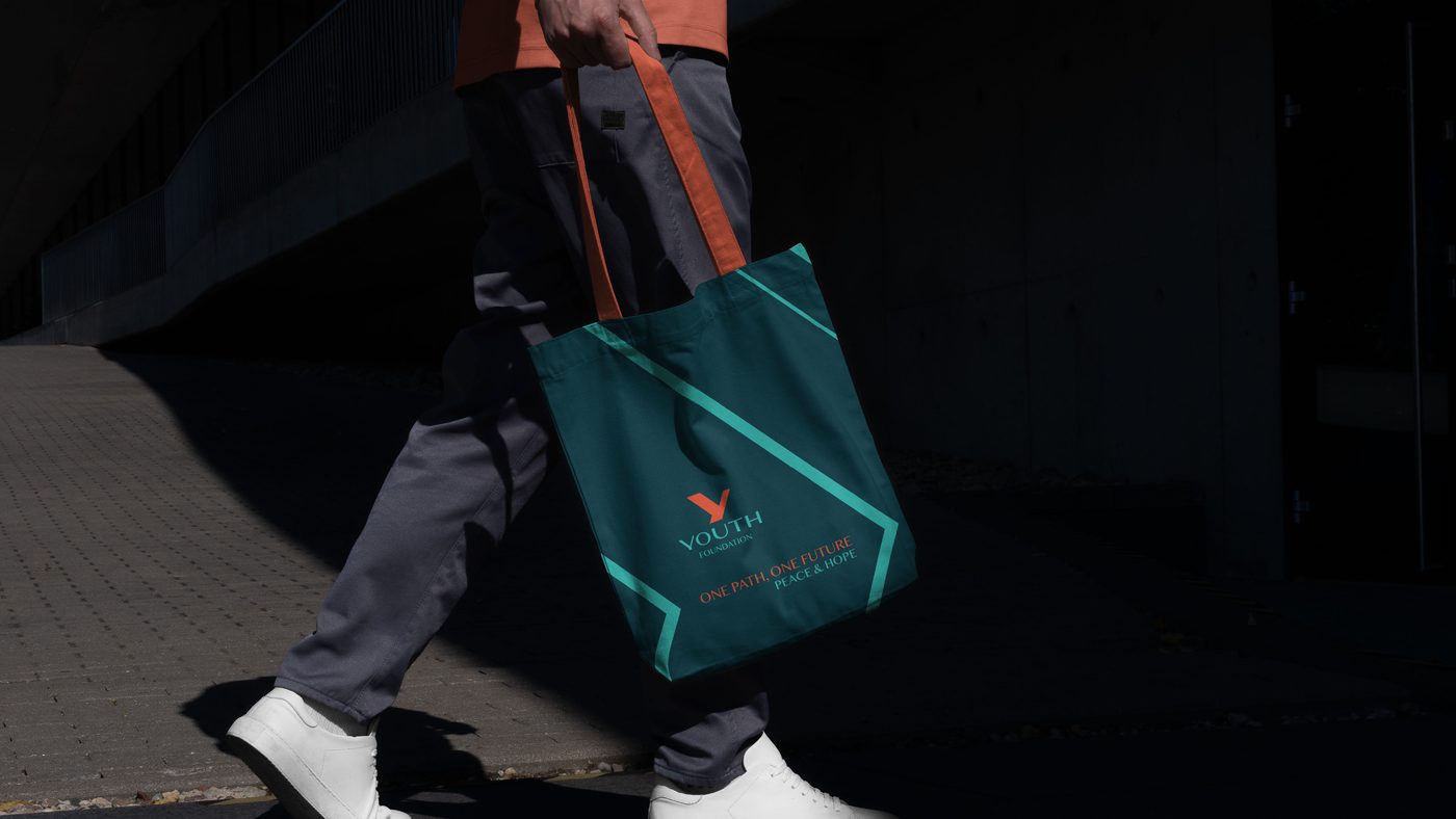
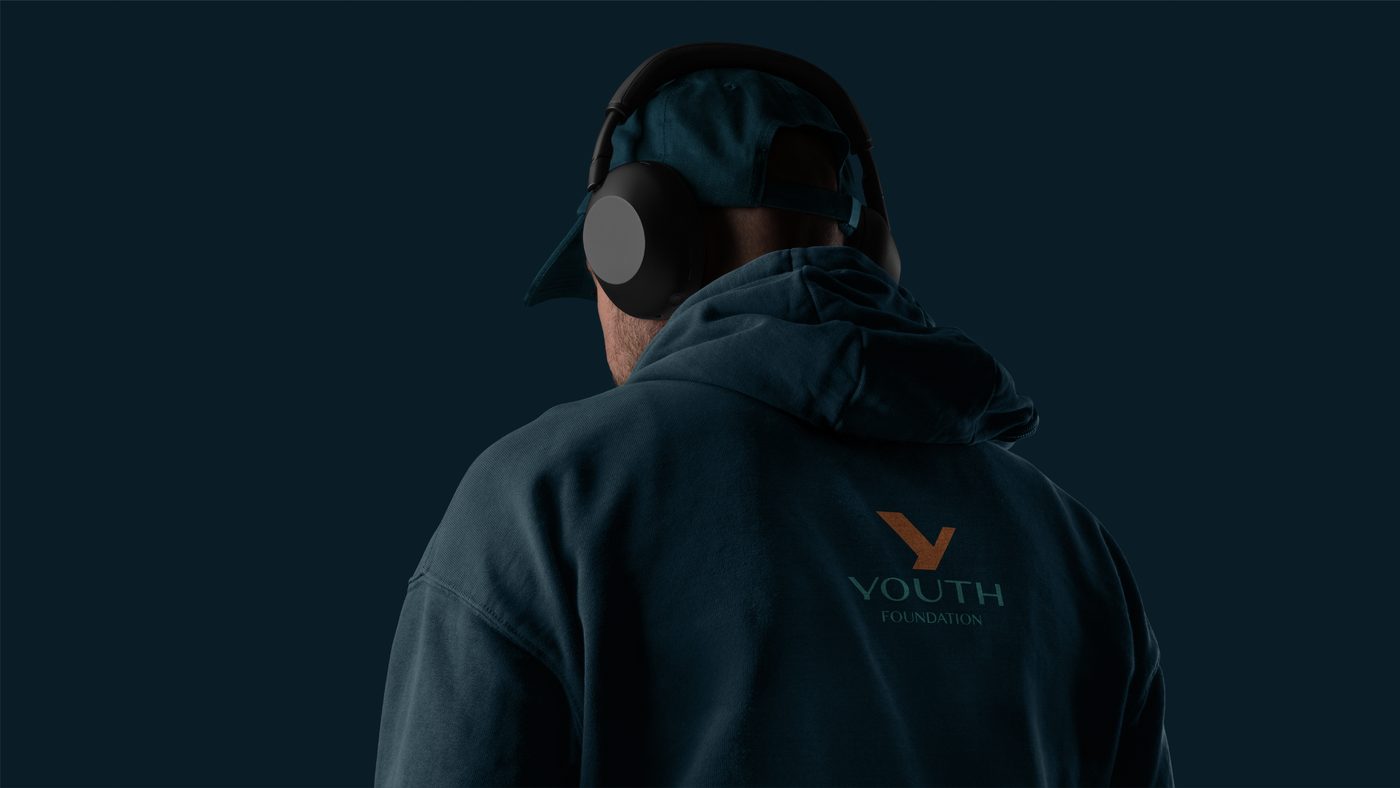
Conference stages, signage, stationery, hoodies and totes, official and wearable at once.
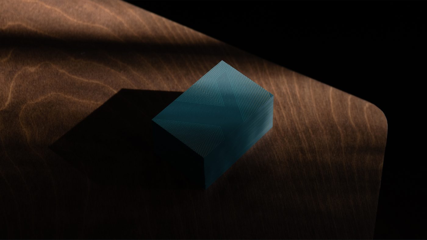
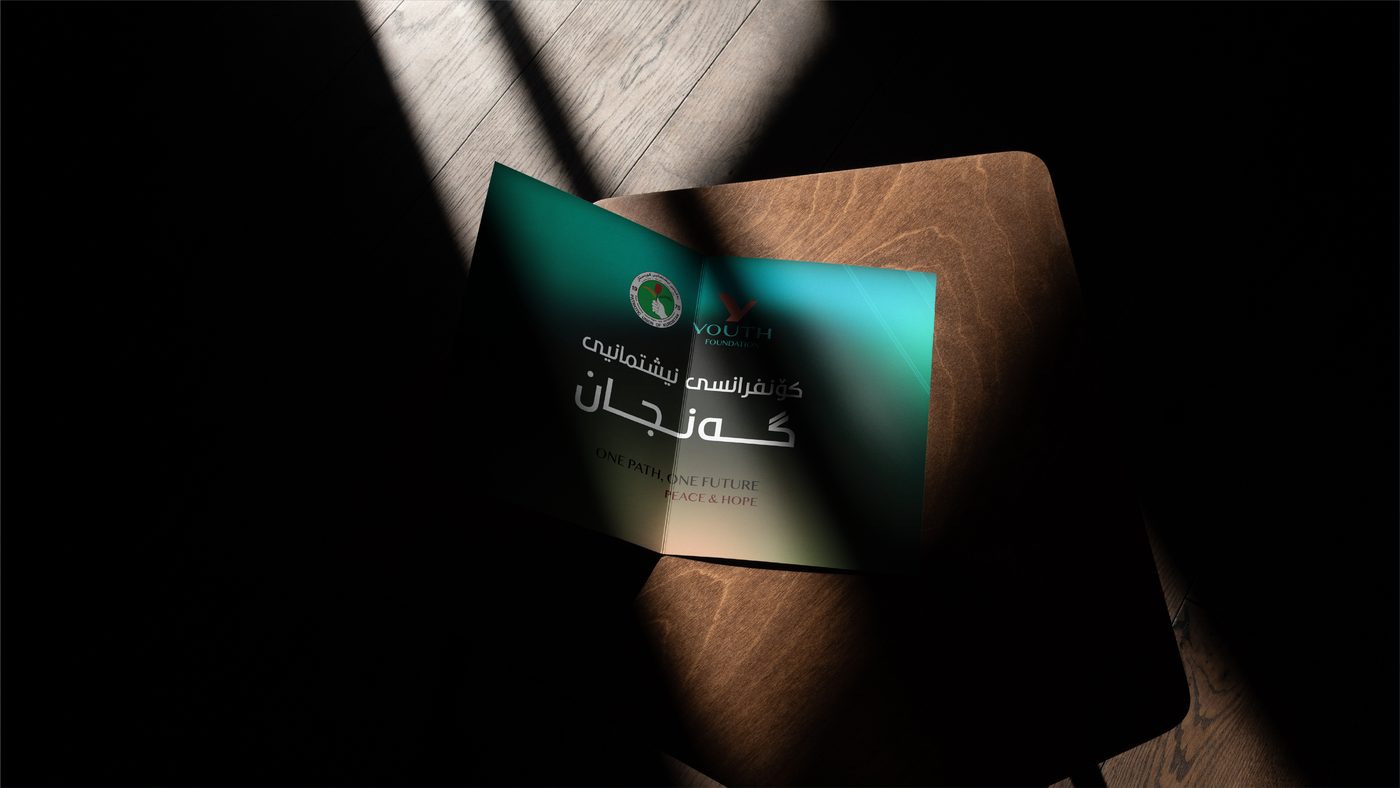
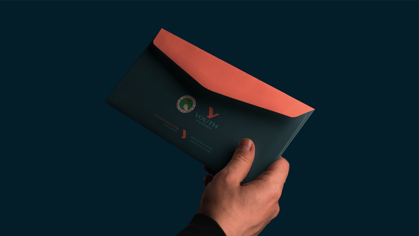
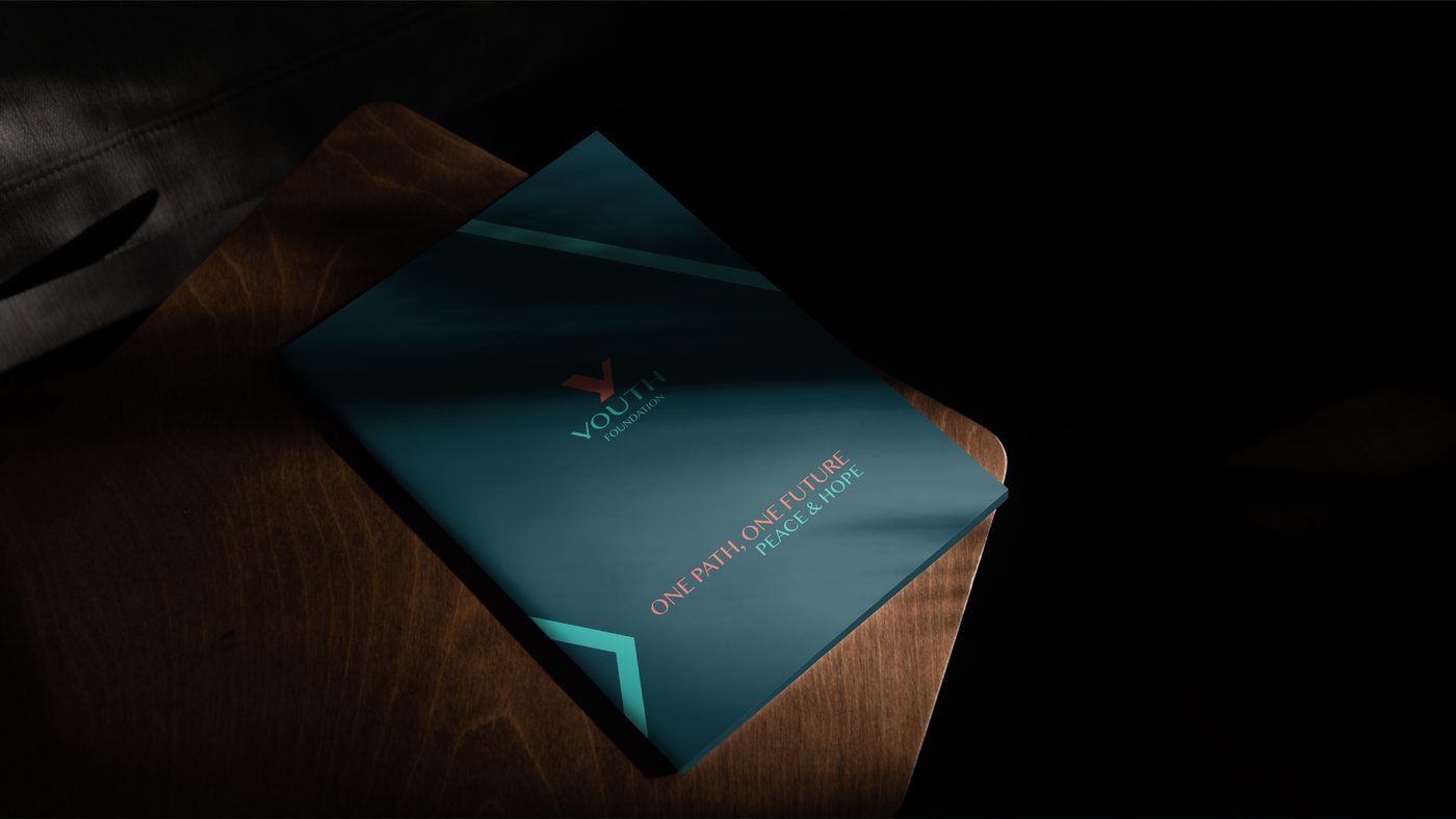
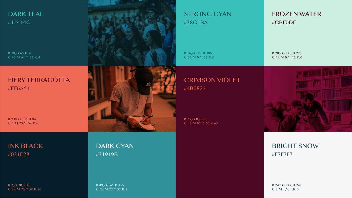
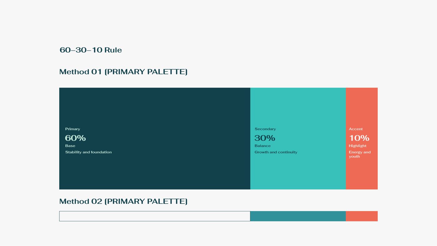
The Y points upward: two routes meeting in one motion. Coral brings the energy, deep teal the institution. An identity built to live everywhere, from official signage to streetwear.

Next chapter