
Brand Identity System · Industrial
In the industrial and metal refinement sector, trust is built on durability. This identity system is anchored by a single, unwavering philosophy: Simply Strong.
Identity system: bilingual logo, brand guideline, stationery and signage.
Metalon works in metal refinement, a sector where brands often look like spec sheets. It needed an identity as solid as its product, bilingual from the start, and consistent from letterheads to door signs.


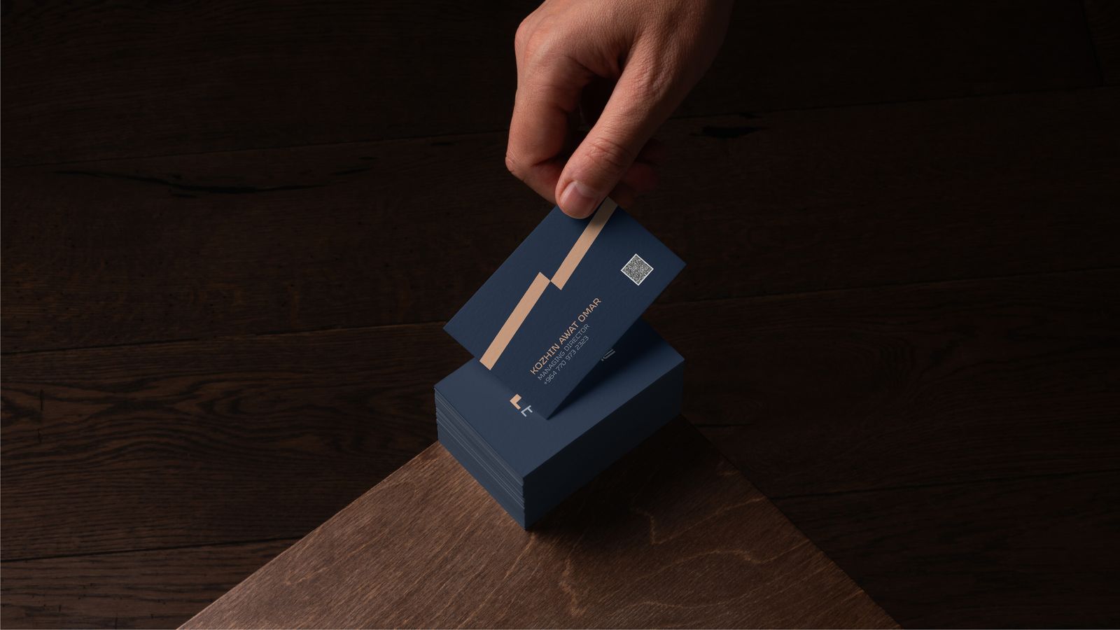
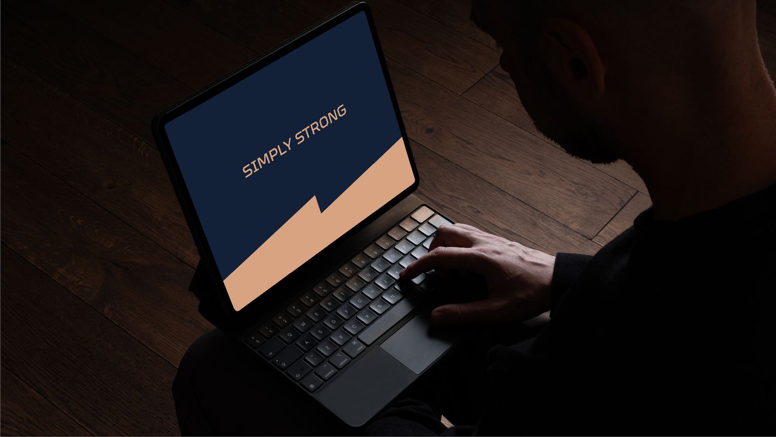


A direct visual representation of structural integrity, precision engineering and raw industrial power.
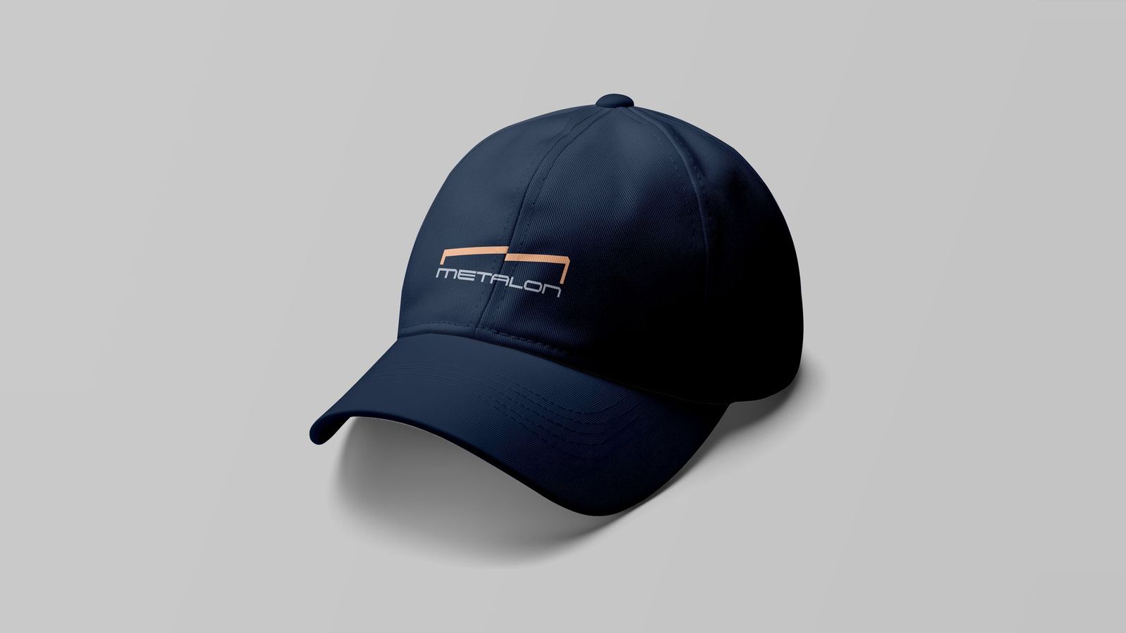

Build the brand the way Metalon builds its product: solid, structural, nothing decorative.
Direct and unwavering. Everything the company stands for, in two words.
“Simply Strong.”
In Kurdish and English, from letterheads and folders to door signs and documents.


Copper on deep steel blue, and a wordmark built like a beam. Every application, from bilingual letterheads to door signs, follows the same engineering logic: nothing decorative, everything load-bearing.

Next chapter