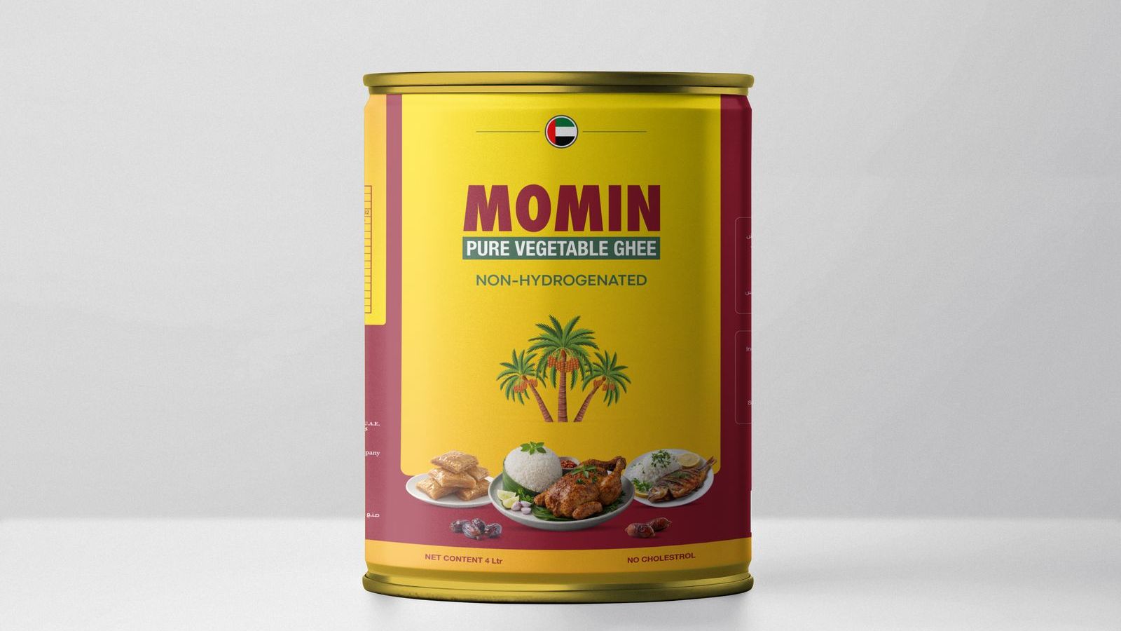
Packaging Design · FMCG
Momin brings pure vegetable ghee to tables across the region. The packaging system builds on the brand’s golden heritage: palm motifs, bold bilingual typography and a shelf presence that reads from across the aisle.
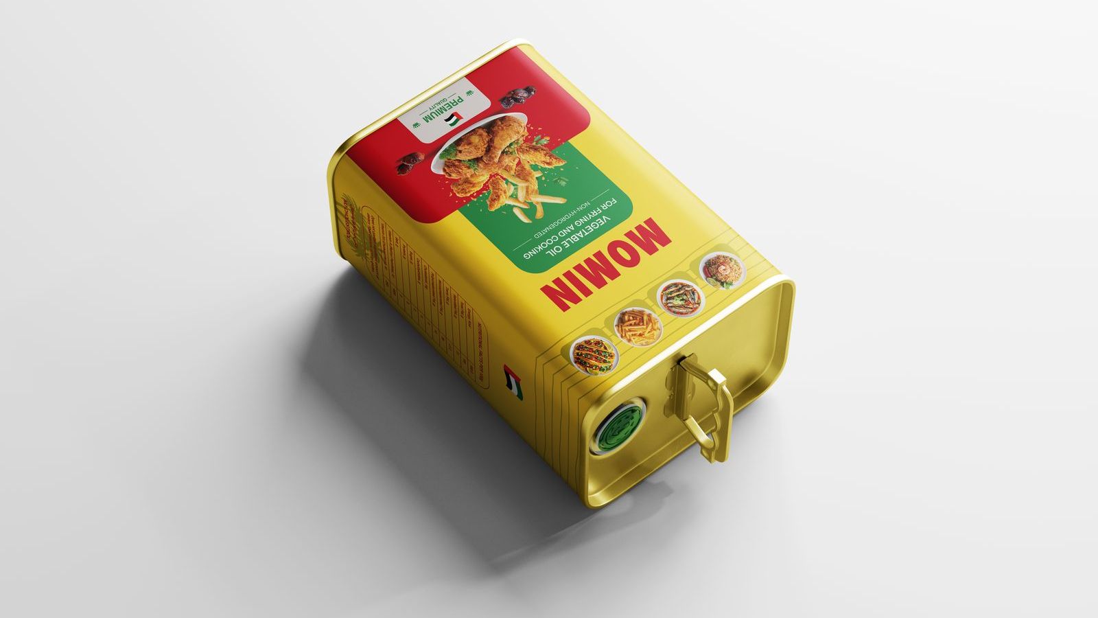
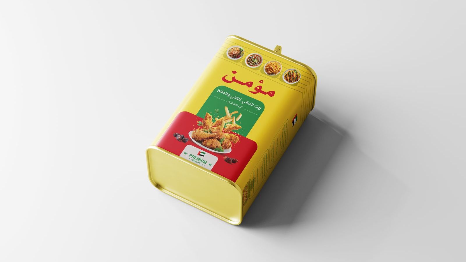
Packaging system: pure vegetable ghee and frying oil lines, bilingual artwork.
A pure vegetable ghee competing on crowded shelves, where shoppers decide in seconds. The packaging had to keep Momin’s golden heritage recognizable while working in Arabic and English across every size, from the tin to the 18L cylinder.
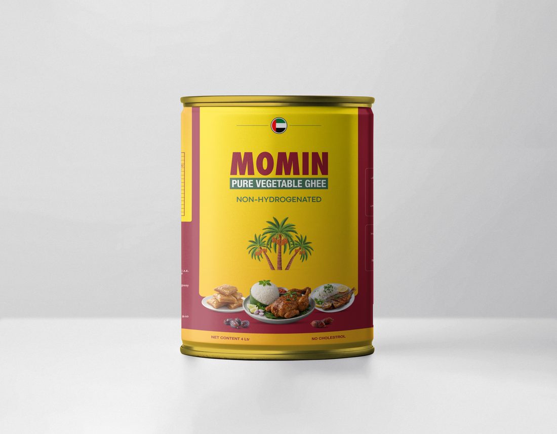
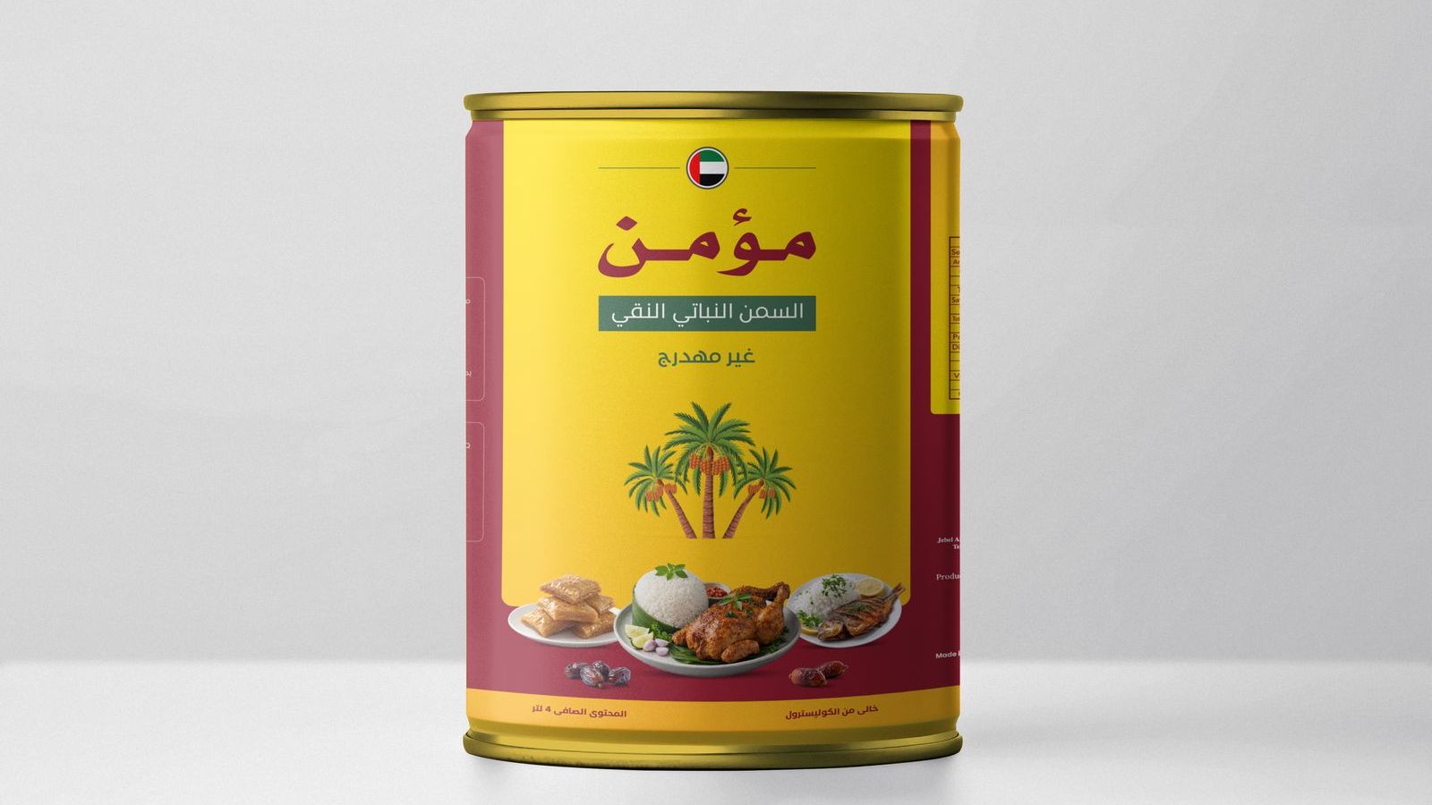
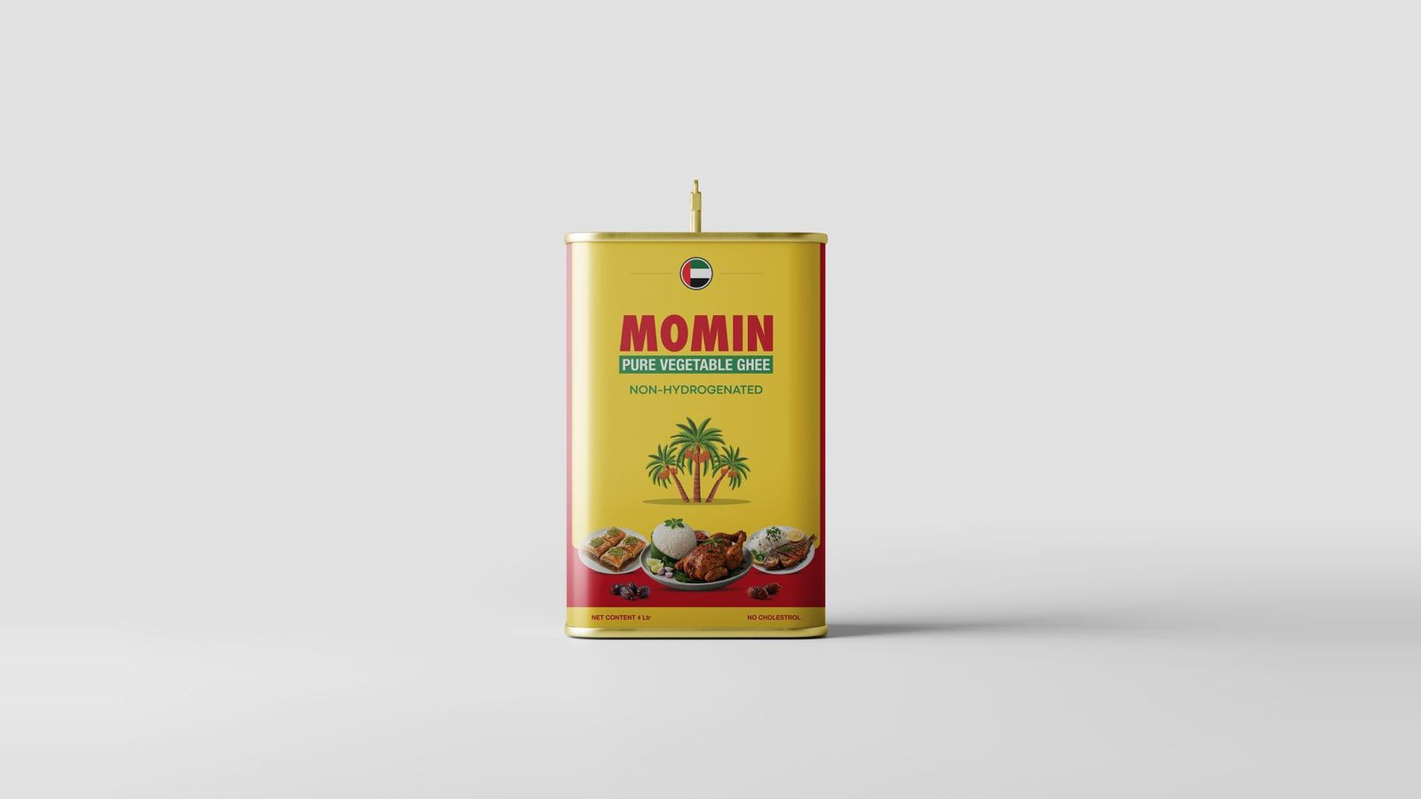
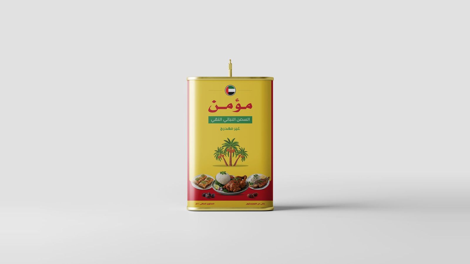
Palm motifs, warm gold and bold bilingual typography: a shelf presence that reads from across the aisle.
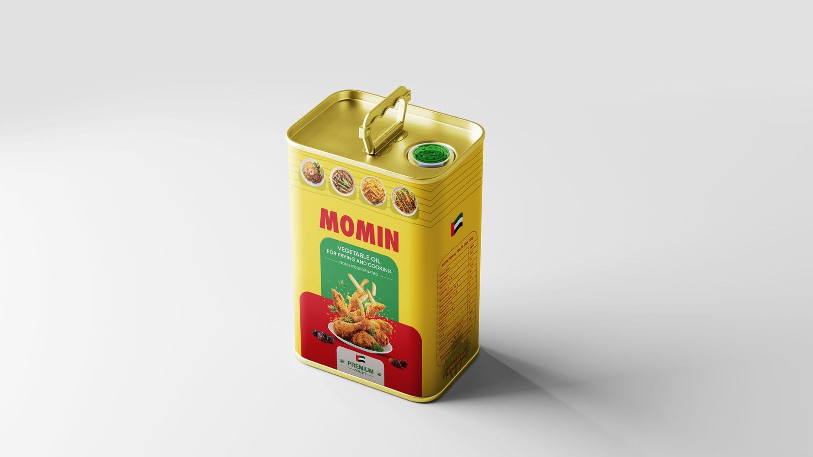
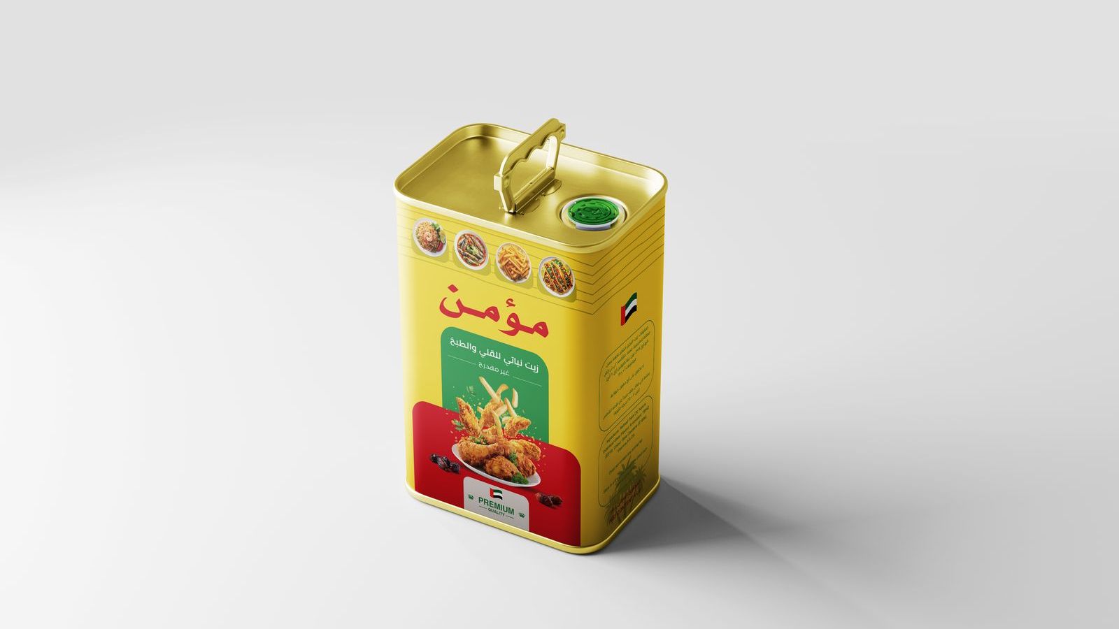
Keep what customers already trust, the gold and the date palms, and make it clearer and stronger.
Plain and honest, the way a family brand should talk, in Arabic and English.
“Pure Vegetable Ghee. Non-hydrogenated.”
One family of packs, from the tin to the 18L cylinder, recognizable from across the aisle.
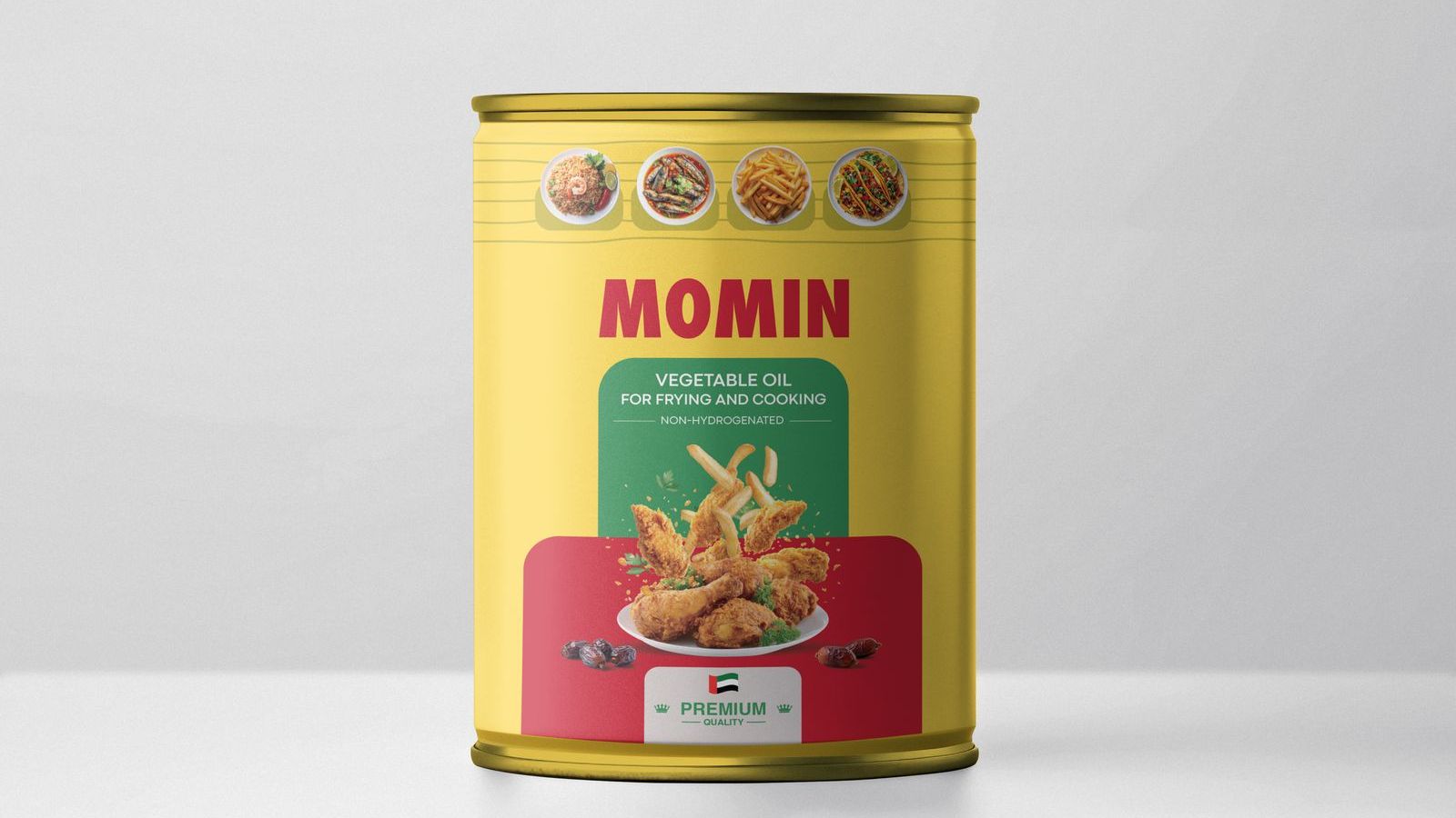
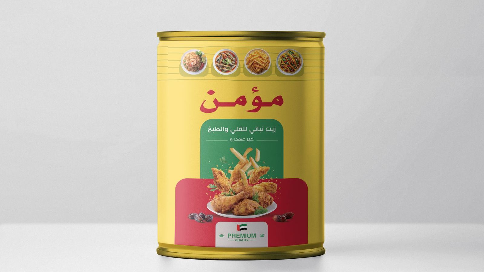
Momin’s gold is an inheritance, not just a color. We kept the palm and the warmth, then rebuilt the hierarchy so the Arabic and English lockups carry equal weight, from the 4L tin to the 18L cylinder.
Next chapter